the sanmar group
Where Integrity Meets Excellence
Where Integrity Meets Excellence
Choose the Font :


Employees’ Corner
‘A Man of Letters’
V Ramnarayan, (Vice President Corporate Communications, Sanmar Corporate Division)
Over the years, the New Yorker magazine has provided me great reading pleasure. Its articles and profiles tend to be long, but solid in substance, rich in content. Its style, typography and design have remained unchanged throughout its existence. Perfection in all aspects of production has been its hallmark. I wonder if a typographical error has ever marred its contents.
Humour is an important ingredient of most of the writing featured in the New Yorker; its cartoons must rank among the best anywhere. I have read some of the greatest writers in contemporary fiction and non-fiction for the first time in the New Yorker, the list including Michael Ondaatje, Jhumpa Lahiri and Amitava Ghosh. Salman Rushdie’s account of his teenage passion for soccer and his fierce loyalty to the Tottenham Hotspurs, peerless prose that lingers in the memory, is only one example of my favourite pieces of writing in the magazine.
The December 5, 2005 issue of the magazine is a treasurehouse of outstanding content. In it, among other things, longtime contributor Alec Wilkinson pays a tribute to a master typeface designer that makes compelling reading. To quote from the author:
“Matthew Carter is often described as the most widely read man in the world. Carter designs typefaces. He is universally acknowledged as the most significant designer of type in America, and as having only one or two peers in Europe. A wellregarded British type designer named Dave Farey once told a reporter, “There’s Matthew Carter, and then there’s the rest of us.”
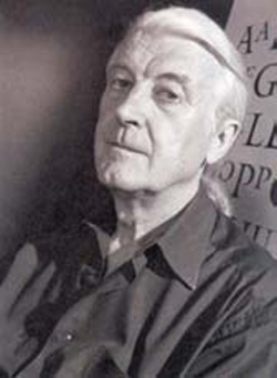
Matthew Carter, type designer extraordinaire.
The 68-year-old Carter is British and lives in Cambridge, Massachusetts. He has designed type for some of the world’s leading magazines and newspapers including Time, Newsweek and Business Week, the New York Times, the Boston Globe, the Washington Post and the Guardian, London. Verdana, for long the signature typeface of Microsoft, is his creation, especially commissioned
for computer screens because typefaces used in the print medium could be illegible on screen. Bell Centennial, the typeface used by A.T. & T in the phone book, and Galliard, used by the U S Postal Service on a stamp, are also his contributions to typography.
Born in London in 1937, Carter inherited his love for type design from his father, a typographer, designer of books and historian of typography. Trained to be an architect, his mother worked as a draftsman. World War II broke out when Matthew was two, and during evacuation, with his father away at the war, the boy learnt to read from an alphabet his mother cut out from linoleum at their new home in Croydon. “Gill Sans, a popular typeface of the time”, Carter recalls. Early impressions were made by the books his father had designed that his mother showed him.
Carter was a misfit at boarding school, as he “liked art, which no one considered important, and bebop, which the school disapproved of.” At 17, he joined Oxford, but the school suggested he take a year off and come back later, as he was much younger than the other students who had all done military service, something Carter’s asthma prevented. His father arranged an internship for him at a printing company in the Netherlands, in Haarlem, called Enschede en Zone, where he learnt to make type by hand, using techniques that hadn’t changed for 400 years. He was one of the last men in Europe to learn to cut type by hand.
Upper case, lower case
The alphabet was organised into capital and small letters around 800. The capital letters derived from inscriptions on Roman monuments, and the smaller letters from handwriting. The first book that could be easily carried around was printed in Venice in 1501. It was called a pocket book. It was printed in italic, which was thinner than the other styles of type, and was said to be an imitation of Petrarch’s handwriting. Printers kept their letters in cases arranged before them on a table. Each letter had a compartment. Capital letters were kept in the upper case, and small letters in the lower case. How many copies of each a printer kept on hand depended on the work he did. Dickens used a lot of vowels. Lord Macaulay used mainly consonants. Tastes in typography have always been narrow. When John Baskerville introduced a typeface in England in 1757 which was thinner than Caslon, the dominant face of the period, people thought that it was so shocking by comparison that the strain of reading it would make them go blind.
After a year at Enschede, Carter decided to pursue a career in typography rather than go back to college. Returning to London in 1956, he moved in with his parents, painted signs and did lettering work. Punch cutting jobs were hard to come by, so he moved to London in 1958, and found work with a group of designers, aspiring to an international
style in type design. His work there put him on a magazine cover, and one of his father’s friends, impressed by what he saw, helped him to travel to New York, something Carter wanted to do, without knowing exactly why.
The rest of the New Yorker story describes how Matthew Carter evolved as one of the greatest living type designers in the world. I shall confine myself to quoting a couple of inspiring passages from the article and invite the reader to share the joy I experienced reading them.
He gave Carter three hundred pounds, and in April of 1960 Carter arrived in the city. Much of his time he spent visiting graphic design studios. “It’s hard to recall, in these days of the global village, how different design was in different places. I had grown up in a type-making privileged situation, and I’d had my year at Enschede and my time in London, and I was cocky, but once I got to New York and saw the level of work the designers were doing—in magazines and advertising, in posters you would see around the city, at the exhibitions I attended, the entire aggregate impression—I was made abruptly and forcefully to realise that I knew nothing.” He felt that he was faced with two choices: to slink home or to resolve to stay. “The cowardly part of me could have gone back to England and pretended I hadn’t seen all of this design,” he says. “Or I could decide, Wake up, Matthew, you’ve been living in a fool’s paradise. You crossed the Atlantic and found something that knocked you sideways, now it’s your move.”
 In the spring of 1960, the John Coltrane Quartet played its first engagement. Carter was in the audience. Over several weeks, he heard them three or four times. “Sometimes they played the same songs in the second set as they played in the first. Not because they were lazy but because they wanted to surpass themselves, or find something in the music that they hadn’t found earlier in the evening. They were that acute. Their seriousness of purpose was a lesson. Four great geniuses who would knock themselves out every night when instead they could have coasted. I felt I could have been dishonest enough to return to England and say I hadn’t seen great design. But I couldn’t somehow pretend that I hadn’t heard the John Coltrane Quartet.” As it happened, Carter couldn’t find work in the city and went back to England, where he worked as a designer, but in 1965 he was hired by Mergenthaler, whose offices were in Brooklyn.


Designed by  F5ive Technologies